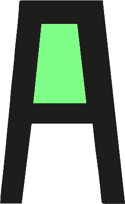

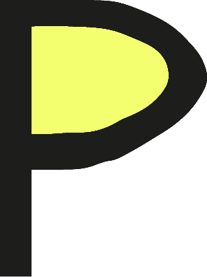

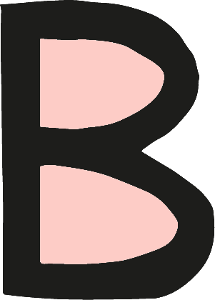
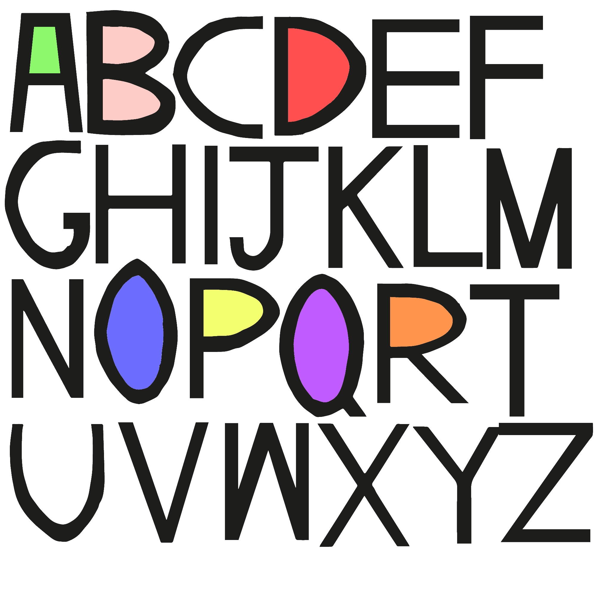
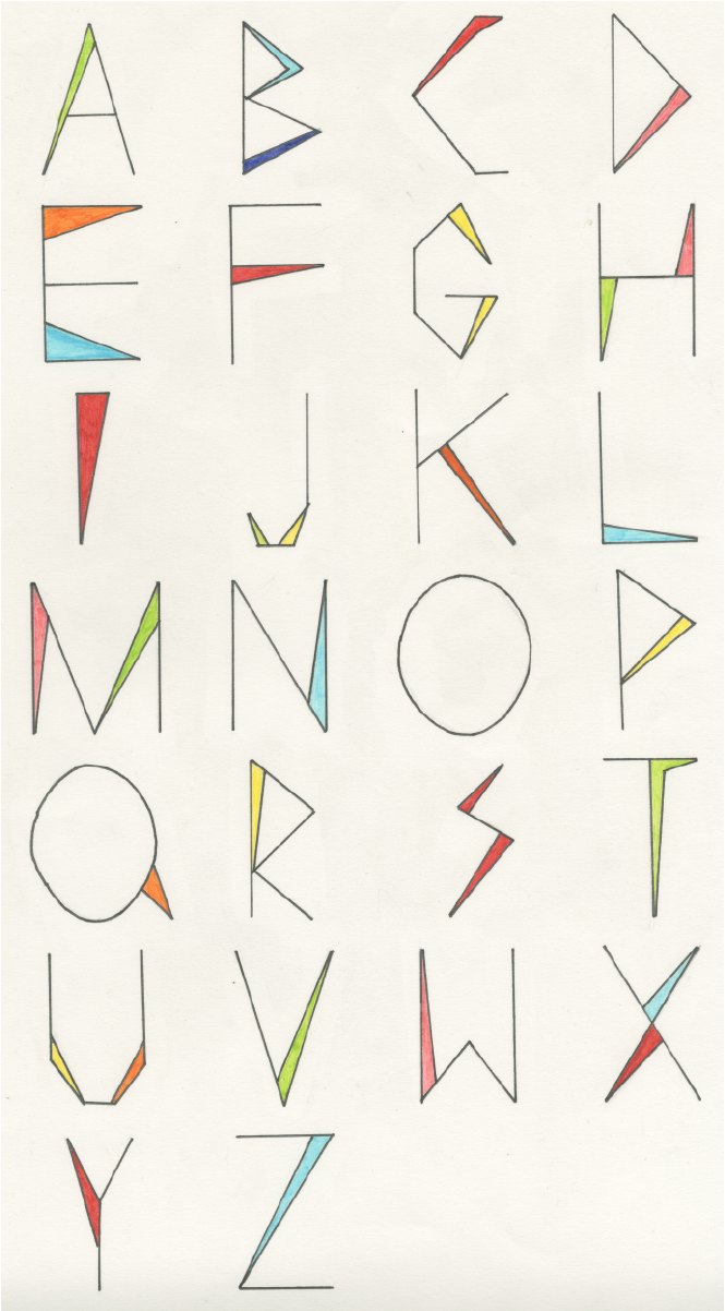
I am brand new to Typography and these are my first two alphabets that I have created. The designs look very different, the first image I almost finished. I got to the point in illustrator where I was clipping and altering the letters using the anchor points to improve the letters ensuring I had smooth corners and no uneven edges. I did not however realise how much of a massive undertaking this is for a novice. I could literally spend a week tweeking and editing the letters making them perfect, I thought it could be something I can come back to when I have more time. I did completely finish the letter A using this process. The second alphabet was my very first one where I used straight edges with some bits of colour on each letter. Though I did not know it at the time these alphabets are a reflection on my personality. I like colours subtle colours - nothing to shouty. I like my designs to stand stand out, but not be shouting hey look at me! I hope to improve my technique and study the technical process around typography as I was just using my prior knowledge of photo-shop and illustrator to create these alphabets.
